
First Data Science Project at Metis
This Monday, I started my first week of this intense yet exciting 12-week Data Science Bootcamp with Metis. Right away, we were divided into groups of 3 to start working on our first project which will be due in 4 days applying the knowledge/tools we just learned. The objective of the project was to make recommendation to a hypothetical client “Women Tech, Women Yes” on how they should allocate their volunteers for their upcoming fund raising event, the WTWY Gala, so that they could optimize collection of signatures and gala attendance.
Data Collection and Cleaning
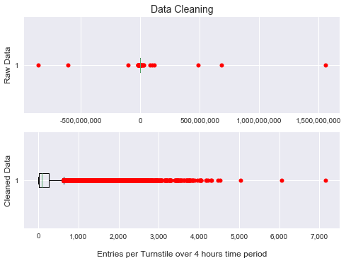
Since the gala will be hold early summer next year, we retrieved published data from New York City Metro Transit Authority data in May 2017 to minimize any noise that could be introduced by seasonal disturbance. The raw data from MTA record the cumulative counts of entries/exits every 4 hours on a turnstile level. We first processed the data to show the number of entries/exits in every 4 hours time period. When we looked at the data, we noticed there are a lot of big outliers as shown in the graph below. I discovered that these were caused by regular device reset and unexpected malfunction. After setting up threshold and eliminating these outliers(less than 0.08% of the raw data points), our data look much more reasonable.
Where does the most traffic appear?
Next step, we group and sum the cleaned data by station for total entries during the 4 weeks time frame that we are investigating. We then rank the stations from the one with highest traffic to the one with lowest. Below I have plotted a bar chart showing the total traffic for station ranked from 1 to 376 along with a line chart shows the percentage that top N stations traffic make up of the total metro traffic in the city.
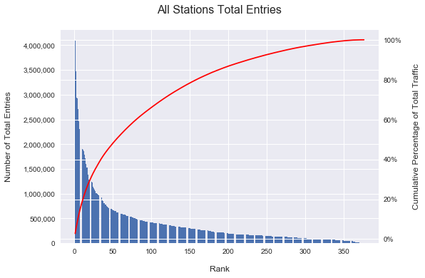
From the chart we could see that the top 55 stations take more than 50% of the total traffic. And the top 150 stations take more than 80%. So we know that the top stations are the ones we should focus on.
When does the most traffic appear?
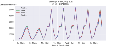
Further looking into the data, we chose the top 5 stations and for each of the station, we ploted how the traffic volume change within one calendar week for all the 4 weeks that we are investigating. We found there’s consistant pattern between different weeks and across different stations. The traffic volume peak time always appear during 4~8 pm when people are out of work and heading back home. At peak, there are around 150 to 290 passengers pass by per minute.
Recommendation & Action Plan
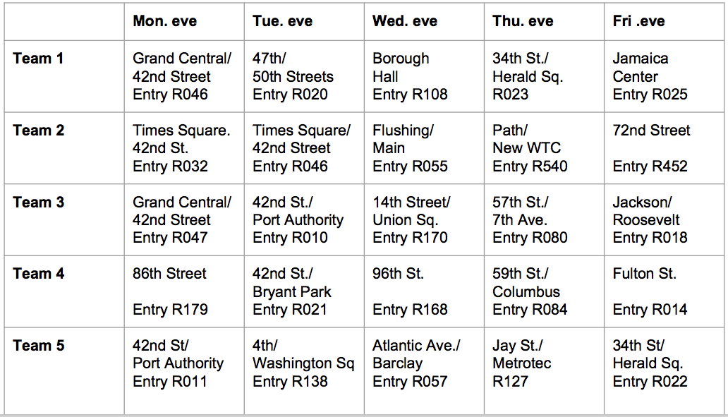
Since the peak time appears at the evening and people may tend to have more time to stop and chat. We recommend to target the commuters and assign volunteers during weekday evening times. By using a rule of thumb of 1 volunteer to 50 passengers per minutes. We recommend to have 3 to 5 volunteers per team. We then chose the top 25 entrances with the highest traffic and put together an action plan shown in the table below. In the action plan, we recommend to recruit 5 teams of volunteers (25 people in total). Each team will go to a different station entrance on each workday. This way, we will cover the top 25 entrances within one week and at the same time utilize the volunteer team efficiently.
Additional Works
This project was a introductory exploratory data analysis on MTA data. With more time we would have taken more factors into consideration and refine the recommendation that we have. We would look into demographic information and business registration information to target tech business areas of NYC.